Many teams reach a point where a simple RAID log isn’t quite enough. As delivery accelerates, senior stakeholders want to see not just the list of risks, but the pattern — what’s low probability but high impact, what’s clustering in the red, and where the conversation should really be focused. That’s where a risk matrix becomes useful: a grid that groups risks by probability and impact, and displays them clearly on a dashboard.
Smartsheet can handle this elegantly, as long as the underlying structure is set up correctly. The walkthrough below shows a practical way to build both a 3×3 and a 5×5 matrix using the standard RAID log that Prodactive deploys in programmes of all sizes.
To give you a fast start, we’re providing the risk matrix 3×3 grid so you can modify this to your own needs.
Start with a Standard RAID Log
The starting point is a RAID log where each entry is tagged with a type: Risk, Issue, Action, Decision, and so on. In the demonstration, only risks were included to keep the matrix clean.
Each risk carries two key fields:
- Impact – low, medium or high (or a numerical rating in the 5×5 version)
- Probability – again low, medium or high (or one to five)
These two values drive everything else. Once they’re in place, the sheet powering the dashboard can begin to sort and categorise the risks into the correct grid position.
Use JOIN(COLLECT) to Populate Each Square of the Matrix
Each cell in the grid is driven by a formula. The logic is straightforward:
find all risks that match this exact combination of impact and probability, and list them neatly in the box.
To make this readable, two small touches are used:
- Bullet points to separate each risk
- CHAR(10) to force line breaks so risks appear on separate lines rather than one long string
Because each square represents a different category — for example, High Impact / Low Probability — each one needs its own formula pointing to the relevant criteria.
Where no risks match the category, an empty cell is displayed. This is achieved with a simple wrapper, using an IF statement that leaves the box blank if nothing qualifies.
It’s a little more work upfront. It’s much easier to read afterwards.
Displaying the 3×3 Matrix on a Dashboard
To get the matrix onto a dashboard, you need to create a report that yo can then insert to the dashboard. The 3×3 grid appears as a clean, colour‑coded widget, with each cell showing the risk headlines relevant to that category.
In practice, this gives programme sponsors a quick view of where attention is needed:
- a heavy tail in Medium / High
- or, occasionally, the rare but reassuring Low / Low
Because the sheet is driven by live formulas, the dashboard updates automatically as new risks are logged or re‑scored.
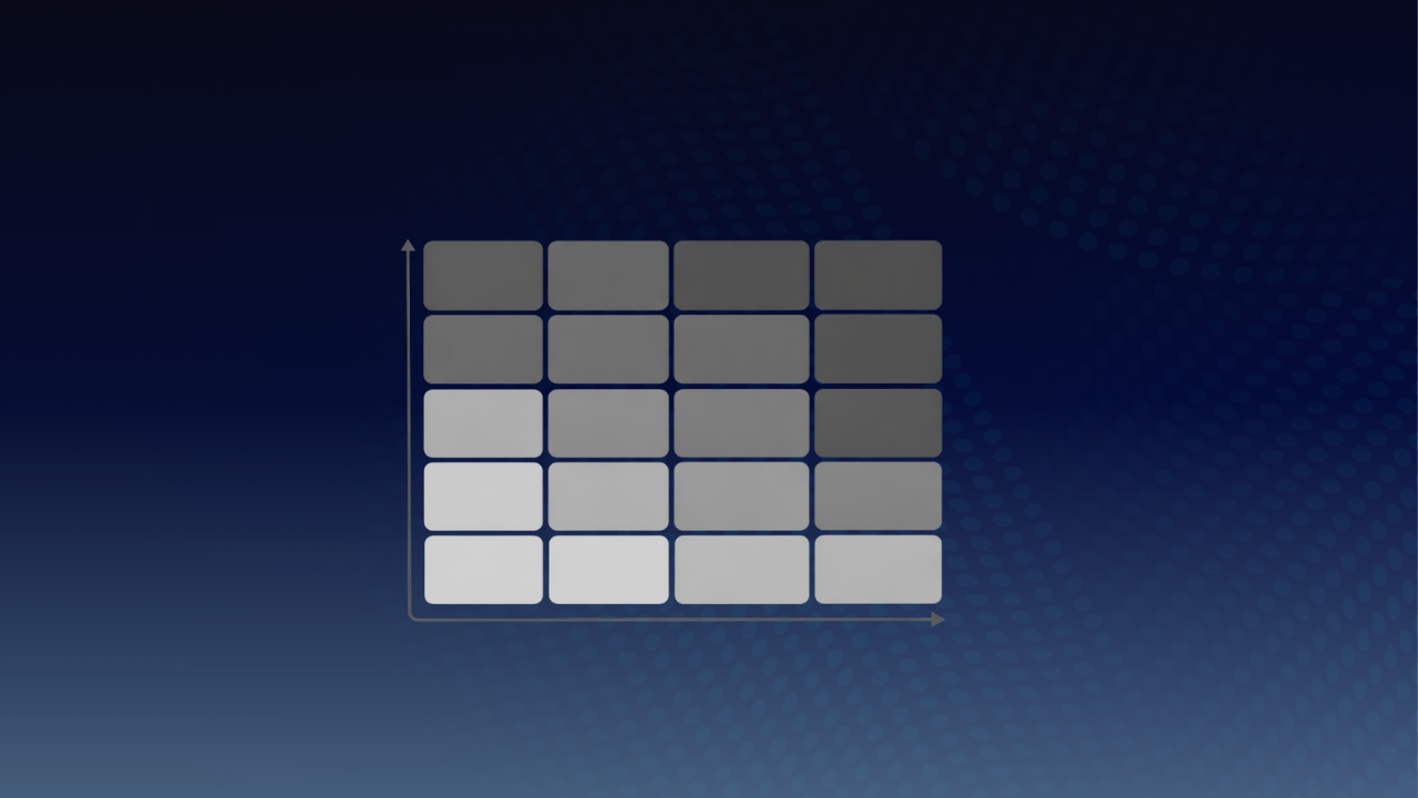
Moving to a 5×5 Version (If Your Organisation Needs It)
Some organisations prefer a more granular approach. In those cases, a 5×5 matrix can be built using the same method — the only difference is that probability and impact are scored from 1 to 5, rather than low/medium/high.
This allows for more nuance, but does introduce a few additional considerations:
- If you are doing this in a RAID log and not just a Risk log, you need to account for actions and decisions that typically carry a single rating rather than two, so they need to be handled differently or excluded.
- Colour coding becomes more important, because a grid of 25 boxes is harder to scan without visual cues.
- The formulas become longer, though the underlying logic remains the same.
The demonstration highlighted this using a working 5×5 sheet — slightly more complex, but perfectly manageable once the pattern is established.
Practical Notes for Delivery Teams
A few points tend to make the difference between a neat demo and a genuinely reliable tool:
- Consistency of scoring: the matrix only works if the team agrees on what “high probability” or “probability 5” actually means.
- Clear headlines: risks appear in a confined space, so concise titles matter.
- Governance alignment: the dashboard becomes far more valuable when it matches the language used in steering packs and decision forums.
A Simple, Scalable Addition to Any Smartsheet Setup
A risk matrix is not complicated, but it is a meaningful step up from a standard list. When implemented well, it gives delivery leads, sponsors and PMOs a shared, instinctively readable view of where pressure is likely to come from.
If you want any help with this or deeper project‑management capability is needed — whether building RAID structures, programme frameworks or full delivery dashboards, get in touch. At Prodactive, we support organisations of all sizes using Smartsheet as their execution platform.